The headache
Tint is hard to picture and easy to get wrong. Shoppers want a price for their car, proof the shop knows its stuff, and a way to ask by text.
In the way: A contact form is one more inbox for a shop run from a phone.
The fix: Every booking button starts a text to the shop's own number. Call sits beside it.
In the way: Price depends on the glass, so one flat list confuses people.
The fix: Packages are priced by panel, so customers match the job to their car.
In the way: New customers don't know what happens after they hand over the keys.
The fix: A step-by-step section runs from the first text to the warranty.
In the way: A separate website gallery is a chore nobody keeps up.
The fix: The gallery is the shop's own photos and clips, each opening full screen.
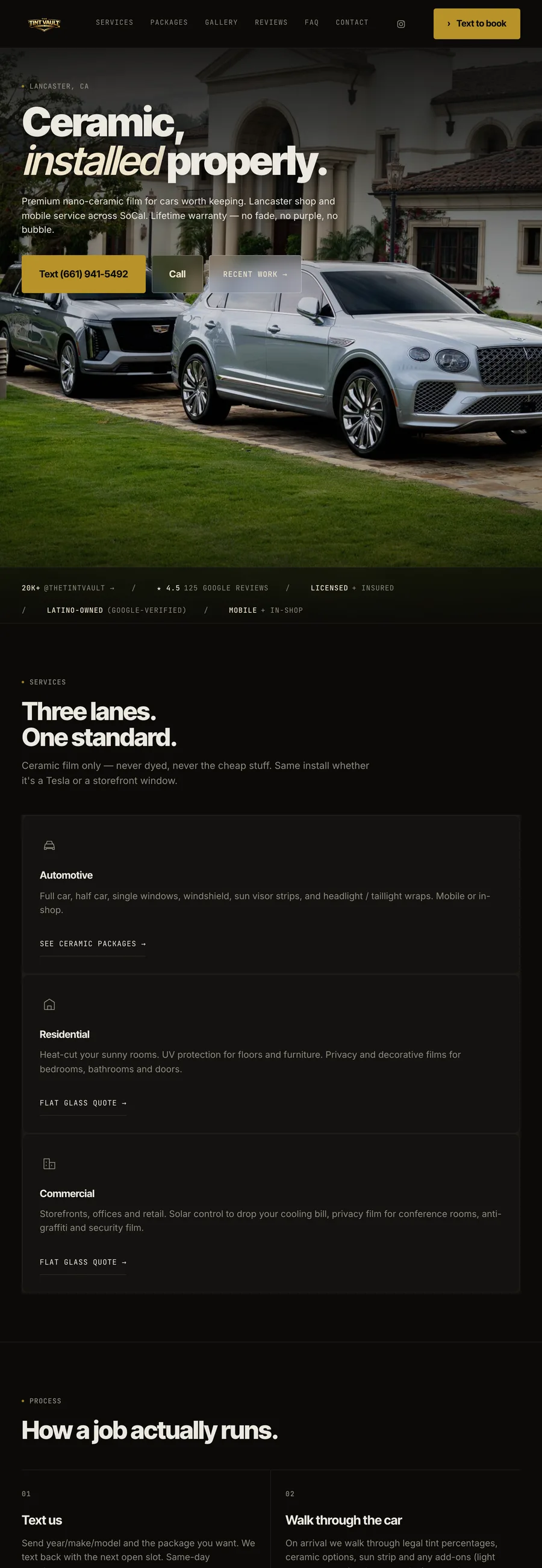
The site proves competence: the lanes, how a job runs, price by panel, why the film lasts. Booking is by text, because that's how customers already reach them.
Up close
The look, and why
A warm near-black, #0b0a08, because on a cool grey the photos of film on glass went blue. Inter Tight sets the headline large without wrapping on a phone. Muted gold, #b89329, for booking buttons and review stars; cream, #efe4cc, for the big numbers.
What does your website need to do?
Send the details. I’ll reply with questions.