Project Array
photo and video studioCustomers book a shoot with a deposit, buy presets and LUTs, and browse a portfolio built around large photography.
The headache
A studio site is mostly video and large photographs, which is exactly what makes a site slow. This one also has to take bookings, sell presets and LUTs, and hand finished work back to clients.
In the way: Photographs come off the camera far larger than a web page needs.
What I built: Every gallery upload is shrunk in the browser before it goes up, with a full-size option for when it is needed.
In the way: Sending a buyer to another site to pay loses some of them on the way.
What I built: The cart opens in a drawer on the page, so a buyer never leaves the shop to start paying.
In the way: Delivering finished files usually means a chain of emails and a balance to chase.
What I built: Each client gets a private delivery link. The balance is paid there and the files unlock.
In the way: One large bundle makes every visitor download the whole site to see one page.
What I built: The code is split by page, so the first load carries only what that page needs.
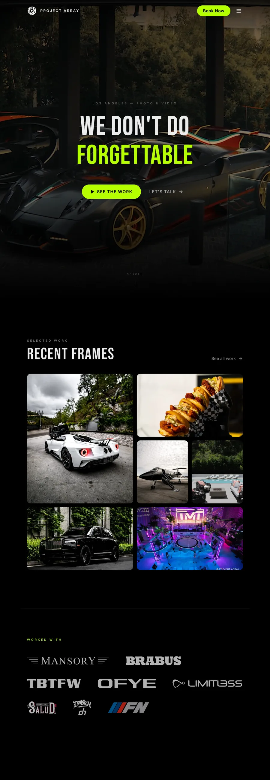
A studio site that has to carry heavy media without feeling heavy. The hero runs video, the gallery is a filterable wall of large photography, and there is a shop and a booking path underneath it all. The work is the product here, so nothing in the interface is allowed to compete with it.
Up close
The look, and why
Black, because every image on this site is somebody else's photograph and any hue in the page would tint it. The ground is a true #000000, so a frame edge dissolves into it and the media is the only lit thing on screen. Headlines are Bebas Neue at 128px: a condensed face fits a long line into one screen width, which is what lets type sit over footage instead of beside it. One accent, a hard lime, on the buttons, the prices and one word of the headline.
What does your website need to do?
Tell me about your business and the project you have in mind.